As airlines continue to offer their premium customers the very best amenities, one way they are stepping up their games is in airport lounge design. We’re taking a peek at the process behind the design of flagship lounges by LATAM and Cathay Pacific.
Putnam brings timeless design to LATAM Lounges
Olivia Putnam, artistic director at Paris-based Studio Putnam, was tapped in 2013 to design the first lounge created after the LAN Airlines and TAM Airlines merger under the LATAM banner. Putnam is the daughter of Andrée Putnam, creator of the studio and the woman tapped to design the interior of Concorde.
Putnam saw the LATAM project as an opportunity to work in South America. “I travel a lot and working on an airport project was very attractive. I always have fun doing my job by trying to imagine what people wish during their experience,” she said. “The easiest part of my job is the beginning of a project, when you feel you have the good answer for the purpose and all the dreams are allowed.”
LATAM’s aim was to offer travelers a unique environment where they could work, be entertained or just get some rest, said Putnam. “They asked me to create a multi-functional place with an elegant and timeless design. Lilian Allen, Mathias Klotz and my studio tried to bring a higher level of sophistication and creativity by adding seduction and elegance into every detail,” she said.
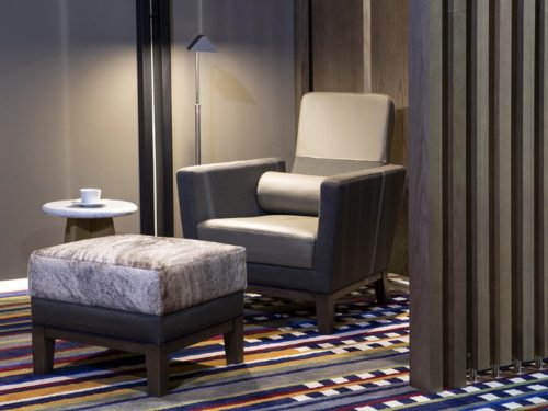
Putnam’s plan was to create a modern setting where people from all over the world could feel comfortable. “I wanted a large table to invite travelers to gather for a moment of work or to share a meal. I designed a super-comfortable daybed in order to read a book or to have a nap,” she said.
It was also important to allow travelers to plug electronic devices anywhere in the lounge, said Putnam. “We all need to charge our devices when we reach the ground,” she said. “The bar is open and anyone can grab a drink with a home feeling. I also created several alcoves that are like little nests and offer privacy for a moment of intimacy.”
Putnam did all this while keeping the region in mind. “I tried to enhance the beautiful diversity of South America by choosing natural and vernacular materials. We worked a lot with local craftsmen,” she said.
The goal for LATAM was to make people feel comfortable with a wide range of options, said Putnam. “We wanted possibilities to suit either the businessman who wants to work as well as the tourist who wants to rest and feel the charm of the country he is visiting,” she said.
The spaces are separated by wooden panels that gives a warm feeling of quietness and intimacy, said Putnam. “My main concern is to offer people a comfortable and unique experience they will remember by enjoying the charm of this refuge in the middle of the airport crowd,” she said. “My preference is for the bathroom. It looks clean and precious. It is like being at a friend’s place.
“The main consideration I have is for the people who are going to live in the space I am designing or the user of one of my object,” said Putnam. “I like to enhance the everyday life by adding a new spirit in the spaces and the objects. It is not a familiar place and yet the visitor feels comfortable.”
Studioilse seeks contemporary luxury for Cathay Pacific
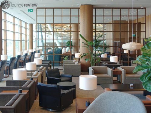
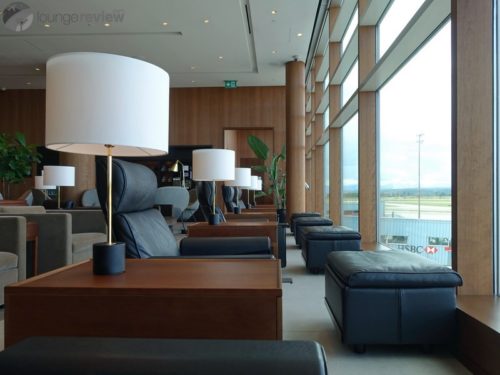
London-based Studioilse, the brainchild of designer Ilse Crawford, was tapped to design Cathay Pacific’s The Pier First Class Lounge located at Gate 63 the North West concourse of the Hong Kong International Airport.
At 2,058 square meters, it was designed to create an environment that makes passengers feel good, engaging the senses and focusing on wellbeing as a core principle, said spokeswoman Jacqui Wills.
“We started by questioning what luxury really means to first class travelers today. Our belief is that wellbeing, health and comfort are contemporary luxury values. We set out to create a lounge where the design, at every point in the experience, makes visitors feel as good as possible,” she explained.
“It made sense to us to use the concept of a contemporary apartment to set the tone and use that as a framework for all elements of the design. We want visitors to feel at home and to feel looked after,” said Wills. “The informality and warmth of a domestic environment is more attractive and appropriate today than the formality of traditional hospitality environments.”
Even in public space, people want to feel at home, said Wills, with the layout of the rooms being simple and following the layout of an apartment. “Orientation is easy and instantly readable for visitors, while also allowing for discovery. Visitors enter a generous hallway area and can see each of the different areas of the lounge from this one room,” she said.
The rooms have more domestic names: the living room bar, the library and the dining room. “The feeling throughout the lounge is one of domestic comfort and the character of a home. This is reflected in the material, furniture and lighting choices, the art, the music and the food, all of which have been considered and curated to feel coherent and realistic,” said Wills. “The experience makes sense as a whole and expresses the heartfelt warmth, considered simplicity and contemporary Asian values at the heart of the Cathay Pacific brand.”
Studioilse’s aim was to deinstitutionalize the lounge experience by making it feel warm, considered, generous and heartfelt. “These are contemporary values that reflect Cathay Pacific’s ethos and message and which we have brought to life in the lounge design in our concept, spatial arrangement, material choices, use of furniture and lighting and the many smaller details that matter so much to the overall experience of the visitor,” Wills said.
The lounge’s use of high-quality and natural materials gives a sense of generosity and permanence, allowing visitors to feel that they are in a quality environment, not a transient space that is only skin deep, said Wills. Materials features in the lounge include:
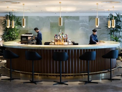
- Honed green onyx for its rich character, color and texture in the hallway walls and living room bar;
- Walnut for its warmth and tactility, used for the paneling and screens throughout and on ceiling of the dining room and wrapping the couchettes;
- Limestone for its smart, reassuring durability, used on floors throughout and in the bathrooms;
- Bronze and brass for their warm and precious qualities, used on screens, the dining room bar, reception desk and details throughout; and
- Leather- and mohair-upholstered furniture, which is tactile and durable.
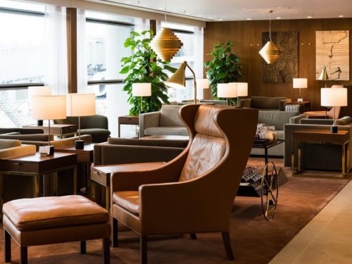
The lounge also has plants to add a dose of nature and suggest a healthy environment, said Wills. “We have also used real furniture pieces as you would find in an apartment from designers renowned for their combination of quality, creativity and comfort.”
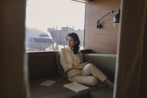
The couchettes in the wellbeing area of the lounge are a signature addition to the first class lounge, said Wills. “They are quiet areas, each with a daybed, a reading light and blind and a heavy curtain to close you in,” she said. “Lighting and blinds are adjustable to allow passengers to control their own environment. Wrapped in walnut and with a view over the runway, they are perfect for a soothing, private spell before boarding.”
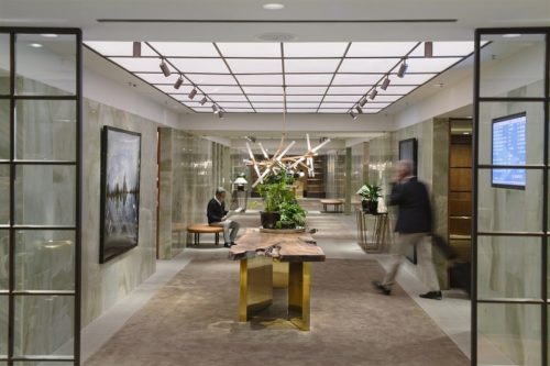
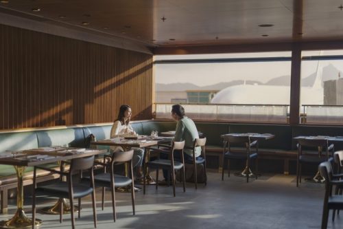
The hallway is an impressive entrance experience where visitors will instantly feel the welcoming, domestic atmosphere of the lounge, wrapped in honed green onyx and anchored with a long sofa, solid walnut tables and statement chandeliers. The dining room is a warm, contemporary room with a la carte dining for 100 people at a time. The walnut ceiling creates an acoustically soft effect, while the dark green leather banquette seating is smart and relaxed.
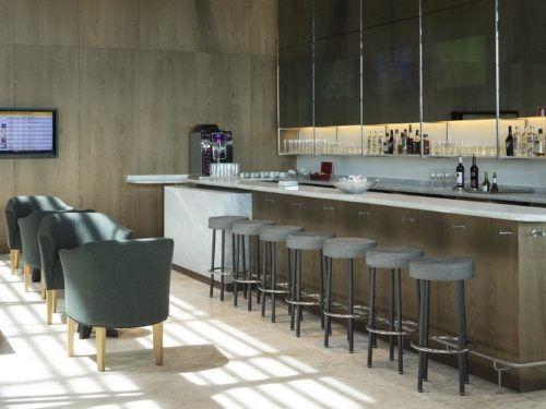
The walnut and onyx horseshoe bar in the living room is a centerpiece. The library is set away from the bar for a softer, quieter experience.
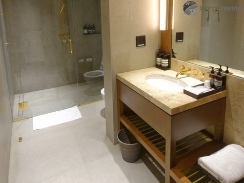
The showers are well-considered, practical spaces where wellbeing has been prioritized, said Wills. “Every detail has been taken care of to ensure as comfortable an experience as possible,” she said. “Wrapped in limestone, with walnut furniture and a travertine vanity, we have ensured there are plenty of hooks and storage for clothing, a seat at the perfect height and lighting at a suitable level that makes visitors feel good.”
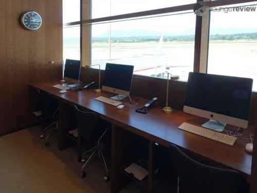
The bureau is a handsome home office with six iMac computers, classic desk chairs and task lights.
Studioilse has used the Cathay Pacific brand pillars as a framework to express the feeling of a life well travelled in the lounge, said Wills. “Our aim has been to deinstitutionalize the experience by making it feel warm, considered, generous and heartfelt,” she said. “These are contemporary values that reflect Cathay Pacific’s ethos and message and which we have brought to life in the lounge design in our concept, spatial arrangement, material choices, use of furniture and lighting and the many smaller details that matter so much to the overall experience of the visitor.”
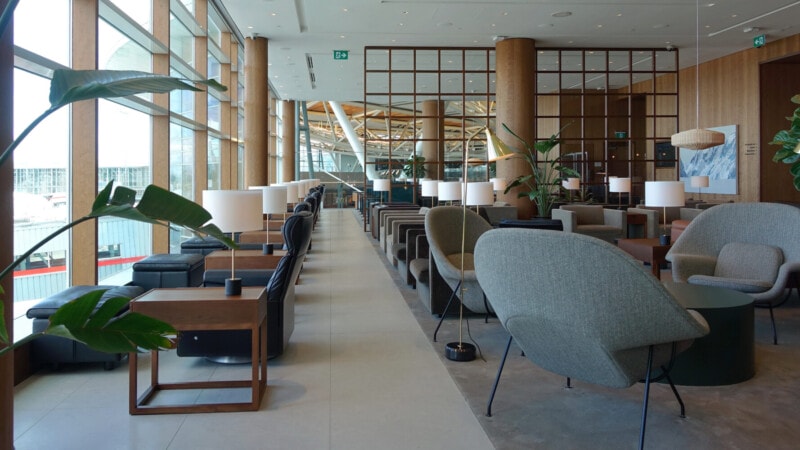
Featured photo: Cathay Pacific The Pier First Class Lounge – Hong Kong (HKG), courtesy of Cathay Pacific

Write a comment or reply